When I was 10 years old I copied a painting and stuck (with fevicol) on the walls of our living room - much to everyone's horror. As I grew up, I later found out that I had reproduced one of the million reproductions of Matisse below.
I was later reintroduced to Matisse by Fareeda when I picked up a book that contained all Matisse paintings in the WWI library. I had taken that book and reissued it weeks after weeks looking at his paintings. The library guys later made it a reference book (wtf) and I had all my plans to steal it before I left college. I still haven't been able to buy that book (out of stock in amazon :( ) or for that matter steal it :).
Matisse had family business of textile industry. He grew up amidst bright colors. His earlier work had all the details of the contemporary painter but later he started making detail free clutter free images. Esp. after his tryst with death after a cancer operation, he became bolder with his art forms hardly cared about the critics and developed his inimitable style. He took the post impressionistic style of painting to another level and we still use his paintings, bright colors, color combinations and style in our day to day life.
 |
| Ipod and Matisse |
Infact good example is ipod ads and various ipod colors themselves. Here on the left is an image of
ipod advertisement and on the right is one of the Matisse works (the read dot is his heart).
The olympic logos 2012 and 2016 Rio ones are inspired by matisse paintings.

On
left are matisse paintings (circle of Life and the Snail) and on
right are olympic logos of 2016 and 2012.
Incidentally Matisse paintings were not well-received by critics. But he found his patron in a wealthy Russian textile magnet who bought most of his paintings. He had told matisse: "These people don't respect you, but the future is all yours".
Lots of contemporary prints, color combinations in textile industry are inspired by Matisse's choice of colors in his paintings.
Colors: For matisse colors were emotions and he felt that colors should be depicted in a harmony. They should be used the way notes are used in music - create a visual orchestra. He was called a "
Fauve" - a wild beast as he used extremely bright colors and not used the color from the real world. For him his paintings were his emotional response of a real-life visual. His choice of colors were lavish- brighter and shinier than any colors seen before his time. He always worked with a color wheel - started off with Yellow Blue and moved around the wheel - choosing simple combinations all right opposite each other or combination of 3 that forms isosceles traingle to more complex ones. Anyone who knows basic color theory today knows that these opposite colors (in right proportion) cancel eachother in a way that their net effect on the eyes is of "grey". The grey color is soothing to the eyes and hence eyes can stay on them for longer. Hence all the matisse paintings had that stay. He himself said that sometimes to balance the painting totally he would externally use "
white and black" that would balance his colors if they themselves did't balance each other. Matisse also used lots of secondary and tertiary colors apart from primary colors.
 |
| Color wheel RGB |
 |
One of my fav matisse painting
|
Patterns: Matisse was well travelled and took influences from various traditional art forms - he was greatly influenced by Russian folk-art forms and Islamic art forms (spending time in Morocco).


He also started having interest in human figures and the
space they are set in.
Matisse loved the bright clutter of overtly furnished rooms, patterns in the room created a parallel complete world in each of his paintings.

Also gradually he started forsaking the idea of 3-dimensionality and treated his painting like flattened space replete with decorative objects.
 |
| Matisse Scissors |
In my house I have two replicas of matisse paintings. Apart from that I have reproduced two of his paintings. One I have given to my brother and other is with me.
 |
| Reproduction with Asim |
 |
| Reproduction with me |
Implications in production design:
Matisse paintings have a richness of their own. And they come from
choice of colors, color combinations and patterns used within the painting. We can use them as reference while choosing and designing our production design elements. Use tested combinations and gradually learn to start expementing on our own.
The other thing is the "
matisse finish" on walls. A block of red wall will always look jarring to the eyes but if the finish is like that of Matisse's walls - it is captured beautifully on camera (for example in above painting - the red of the floor has a different finish - he uses multiple adjoining colors to have that finish).
I sometime call it the "choona finish" that they have in walls.
However to have our films look like Matisse if we need to have massive production design and other controls on the environment we are shooting in. Sometimes this translates into higher budget. So if we are going too indie - we cannot use that 100% control but we can still choose some of the elements like costume colors etc that helps us give our products a "little better than reality" finish (that is if one wants).
Below are some of the frames of the 3 short films I have made and one can clearly see the matisse influence I had. Amongst all our biggest challenge was Uss Paar as we didn't have the control on the color of the station. But we tried to play with yellow(essentially brown) blue.
 |
| Shiva is the ultimate yellow blue God |
 |
| An extra detailing on curtain and the candles adds details to the frame |
 |
| The red (instead of white) boat on greenish water looks better |
 |
| The classical red green frame. Added blue to decrease red |
 |
| The yellow uniform - imagine if it was blue |
 |
| Notice the matisse finish on the walls and Tina's dress color. Also a block of red just to offset too much green on the frame |
 |
| We had specific colors for sarees too but couldn't manage them in timehowever a little color in the form of balloons adds the playfullness. |
 |
| Purple and red hue to make the place look sensual |
Inspite of being a painter, his last work was a chapel where he did lots of glasswork and it is in Venice. I went to Venice and didn't know about the chapel and hence didn't visit it. So you know how much angry with myself I am! Here is the glass work - "Tree of life" by matisse.
Matisse was an atheist but he still made the chapel for his nurse who had turned a nun.
He had once famously said - "I believe in God only when I do my work !"
 |
| Henri Matisse |
 I was later reintroduced to Matisse by Fareeda when I picked up a book that contained all Matisse paintings in the WWI library. I had taken that book and reissued it weeks after weeks looking at his paintings. The library guys later made it a reference book (wtf) and I had all my plans to steal it before I left college. I still haven't been able to buy that book (out of stock in amazon :( ) or for that matter steal it :).

 Incidentally Matisse paintings were not well-received by critics. But he found his patron in a wealthy Russian textile magnet who bought most of his paintings. He had told matisse: "These people don't respect you, but the future is all yours".
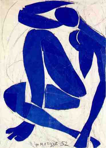


 Also gradually he started forsaking the idea of 3-dimensionality and treated his painting like flattened space replete with decorative objects.


5 comments:
interesting :)
Thanks Grishma :)
Very insightful. I did a painting with lot of colors and with no concept of 3D (this I know now after reading this) and no apparent shapes.I call it core dump. I should upload it sometime :)
Thank you vivek!
you surely should :)!
Like your creativity....
Post a Comment